Marry Me Cyprus
Luxury wedding planning · Cyprus / United Kingdom
marrymecyprus.co.uk
The brief
A planner sells judgement and taste, which is difficult to evidence on a website and impossible to price on a card. The business also spans several distinct services — full planning, day coordination, elopements, legal assistance — that suit very different couples and very different budgets. The site had to make those distinctions legible without reading like a menu, and had to sit at the head of a wider estate that includes a supplier directory and a private client portal.
What we built
We built the public front door for the business: a brand-led site with a page for each service, venue pages that connect couples to the specific properties the planner works with, and a journal that answers the practical questions couples search for long before they enquire. It is the entry point to a three-part system — this site, the supplier directory, and the private planning portal — each built to do one job well rather than one site trying to do all three.
What Each Part Does
Service architecture
Separate pages for complete planning, day coordination, elopements and micro-weddings, and legal assistance — so couples self-select before the first conversation.
Venue pages
Dedicated pages for the venues the planner works with, including L’Château, OZEA and Alassos, linking the planning business to the properties themselves.
Elopement route
A distinct path for couples marrying just the two of them, which is a different sale with a different budget and deserved its own page rather than a paragraph.
Décor and styling
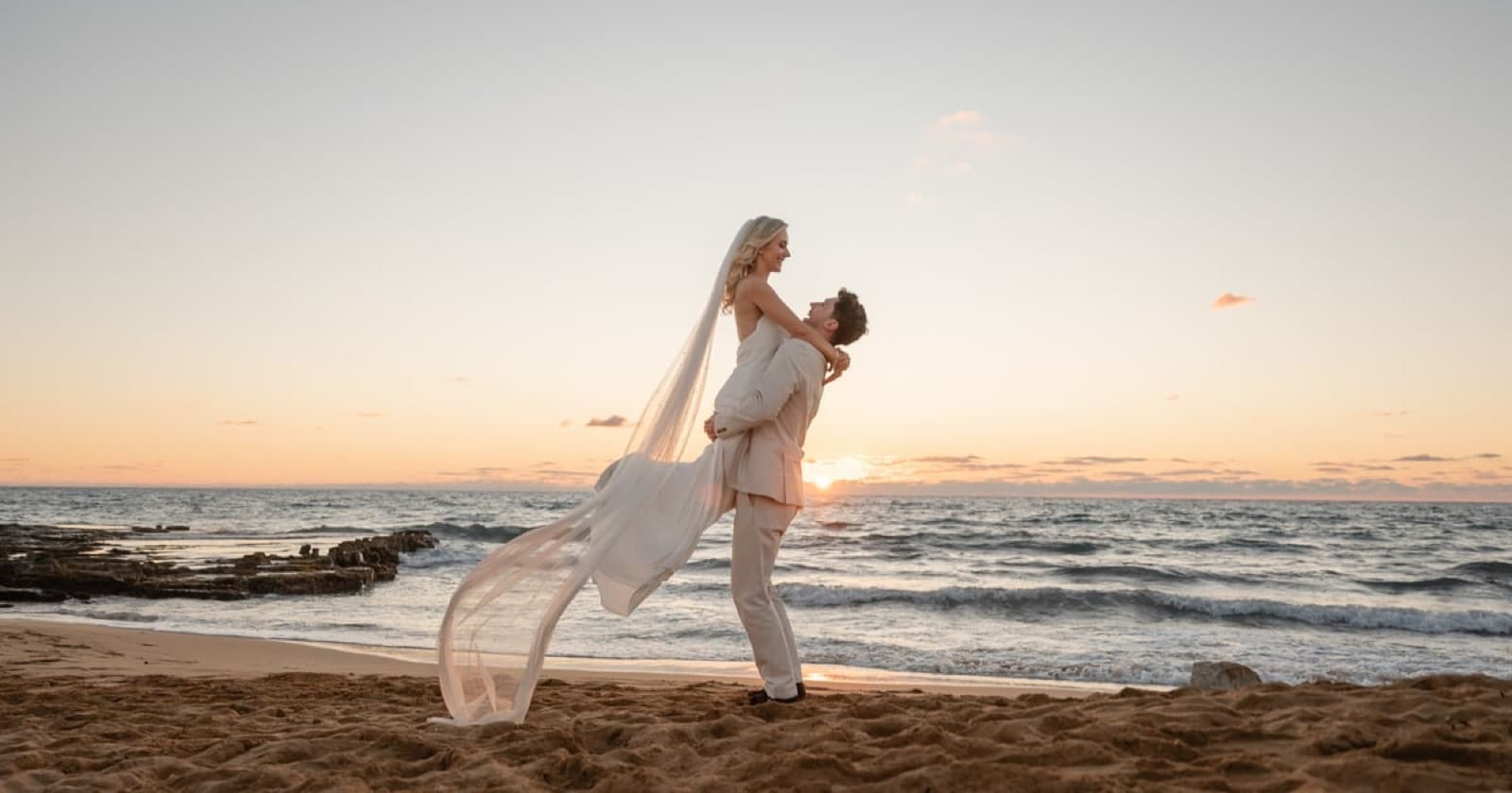
A visual section for the styling side of the business, where the work has to be seen rather than described.
Planning journal
Guides answering the questions couples genuinely search — how long you need to be in Cyprus to marry, how to elope there — capturing research-stage traffic.
Lead capture
A single, consistent enquiry path across the whole site, feeding the planning process that runs in the private portal.
Areas of work
- Web design
- Brand system
- Content architecture
- Technical SEO
- Lead capture
How it was built
- The site states what the business is, who runs it and where it works in a format Google reads as facts rather than prose, so a search result can show those details instead of just a blue link. It will not on its own lift the site above a competitor Google already rates more highly; it makes the listing that does appear worth clicking.
- The supplier directory and the private planning portal are reached at addresses built on the main one — suppliers. and plan. in front of the same domain name — rather than at three separate web addresses, so there is one domain name to renew instead of three. All three share the same typefaces, colours and layout rules, so a couple moving between them can tell it is one business.
- Most of the photography is saved in a lighter file format and sized for the screen it lands on, because on a gallery-led site the pictures are most of what a page has to download. That is the difference between a venue gallery opening on a phone abroad and a couple giving up on it. Pictures added later need the same treatment, or the weight creeps back.
Want Something Like This?
Every project here started as a conversation about what the business actually needed. Yours can start the same way.